Explain the Service Quickly
Visitors needed to understand what mobile FEES is, who it serves, and why on-site swallowing evaluations matter without digging through clinical jargon.
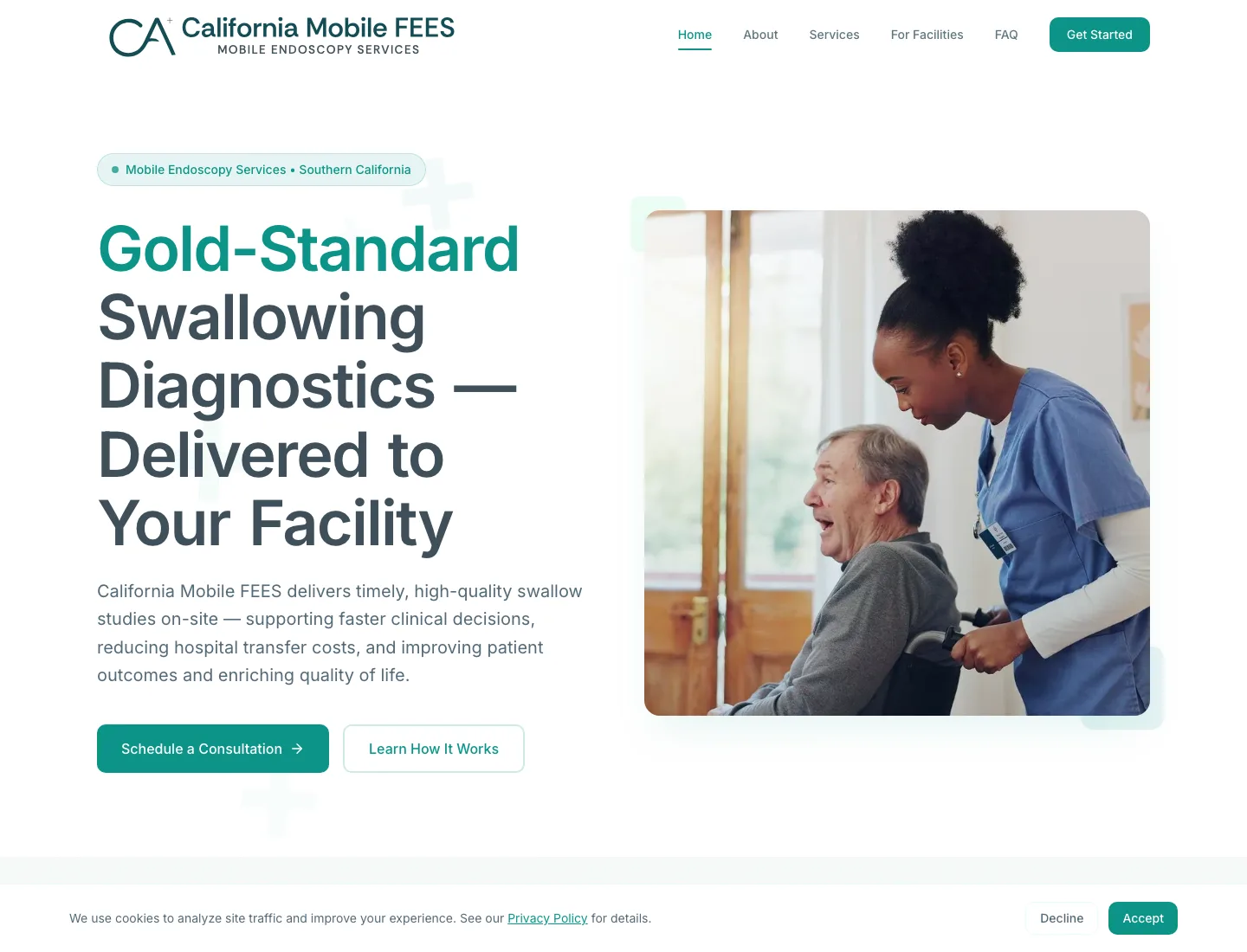
CA Mobile FEES needed a site that could explain mobile FEES, build trust with facility decision-makers, and make consultation feel like the obvious next step.
Snapshot
Client
CA Mobile FEES
Industry
Mobile healthcare diagnostics
Audience
Facilities, administrators, SLPs, and clinical teams
Objective
Make mobile FEES easy to understand and easy to inquire about
The challenge
The site had to make a clinical service understandable quickly without flattening the expertise behind it.
Healthcare website design is not just about looking professional. For clinical and high-trust services, the website has to explain the service, reduce confusion, support credibility, and make the next step clear.
That means the page architecture, copy, and website strategy and SEO foundations need to work together instead of treating the site as a brochure.
For healthcare websites, clarity is not a design preference. It is part of the consultation path.

The strategy
The site was organized around the questions facilities need answered first.
For clinicians and specialized service providers, the website often becomes the first layer of education. Before someone calls, refers, or books, they need to understand what the service does, who it is for, and why it matters.
Lead with the facility problem
Define the service in plain language
Show why on-site evaluation matters
Create one clear path to consultation
What changed
A medical service website has to do more than present information. It has to help different buyers reach the same conclusion: this provider understands the clinical problem and gives us a clear way to act.
Visitors needed to understand what mobile FEES is, who it serves, and why on-site swallowing evaluations matter without digging through clinical jargon.
The site needed to feel credible enough for administrators, SLPs, and clinical teams to take the provider seriously before the first call.
The website had to show how mobile FEES supports care decisions while also reducing the burden of unnecessary transport and scheduling friction.
Once visitors understood the service, the site needed a clear consultation path without making people hunt for contact details.


Messaging
The copy gives administrators and care teams enough context to understand the service, then points them to the next step.
A specialty healthcare website has to translate technical healthcare value into plain-language website messaging while still sounding credible to clinicians.
Technical services earn trust when the right people understand why it matters, when to use it, and what to do next.


Design
The visual system supports trust, readability, and confident decision-making on desktop and mobile.
The same discipline applies to accessibility-conscious website design: hierarchy, contrast, navigation, and readable content all support trust before the first call.
Before
After
Outcome
The finished site gives CA Mobile FEES stronger positioning, clearer service education, and a simpler consultation path.
No performance claims are made without tracking data. The point of the build was to create the foundation a mobile healthcare website needs before measurement can mean anything: clearer pages, better inquiry paths, and a structure that can support local search over time.
Measurement
A stronger website foundation is only useful if it can be evaluated. For a healthcare service page like this, the next layer is tracking how well the site turns clarity into qualified action.
These are the signals that would help connect healthcare landing page strategy to real buyer behavior without inventing results.
No performance claims are made here without tracking data. These are the metrics we would use to evaluate the next stage of growth.
Who this is for
This case study is relevant to any business where the service is valuable, but not immediately understood. When your offer is specialized, technical, clinical, or high-trust, your website has to carry more of the explanation.
FAQ
Yes. The goal is not to oversimplify the service. The goal is to structure the information so the right visitor understands what you do, who it helps, and what step to take next.
Yes. This type of work is especially useful for private practices, mobile providers, therapy clinics, consultants, specialty diagnostics providers, and healthcare-adjacent service businesses.
Yes. The website should separate messaging for each audience instead of forcing every visitor through the same explanation.
Yes. A healthcare website needs clarity, credibility, accessibility, privacy-aware supporting pages, and a clear path to inquiry.
Yes. The site structure should support local relevance, service clarity, page hierarchy, internal linking, metadata, image optimization, and search-friendly copy.
We build websites for specialized service businesses that need more than a clean design. We help clarify the offer, structure the message, and create a path from interest to inquiry.
