Built by Pine
Back to selected work

A Restaurant Website Built to Make the Brand Easier to Explore

Tatsu Ramen needed a site that felt closer to the restaurant experience, moved guests toward menu and location decisions faster, and held up under launch review.

Restaurant brand
Multi-location UX
Mobile-first path
tatsuramen.com
Tatsu Ramen homepage shown with food photography and restaurant navigation
Homepage design for Tatsu Ramen, built to make the brand feel stronger while keeping menu, location, and ordering paths close.

Snapshot

A high-energy restaurant brand with real mobile decisions to support.

Client

Tatsu Ramen

Industry

Restaurant / multi-location hospitality

Audience

Hungry guests, local searchers, returning customers, and delivery visitors

Objective

Make the brand feel stronger online while improving the path to menu, location, and ordering

The challenge

A strong in-person brand needed a clearer digital path.

The website needed to carry Tatsu's atmosphere while helping guests quickly find a menu, choose a location, and move toward ordering.

For restaurant websites, appetite and action have to work together.

  • A strong in-person brand needed a clearer digital first impression
  • Guests needed faster access to menu, location, and ordering paths
  • The site had to support multiple locations without feeling like a directory
  • The launch needed a measurable performance and accessibility baseline
Homepage
Tatsu Ramen homepage section with moody restaurant photography and brand content
Brand-led homepage sections give the site more atmosphere without hiding the practical paths guests need.

The strategy

Make the food, locations, and next step easier to reach.

The site was organized around the restaurant decisions guests are already trying to make: what looks good, where to go, and how to order.

Lead with appetite and brand atmosphere

Make menu and location paths obvious

Design for mobile restaurant decisions

Protect performance during launch

What changed

A tighter path from first impression to ordering intent.

Each section helps guests feel the brand, browse with confidence, and find the next step without extra friction.

Brand-Led Homepage

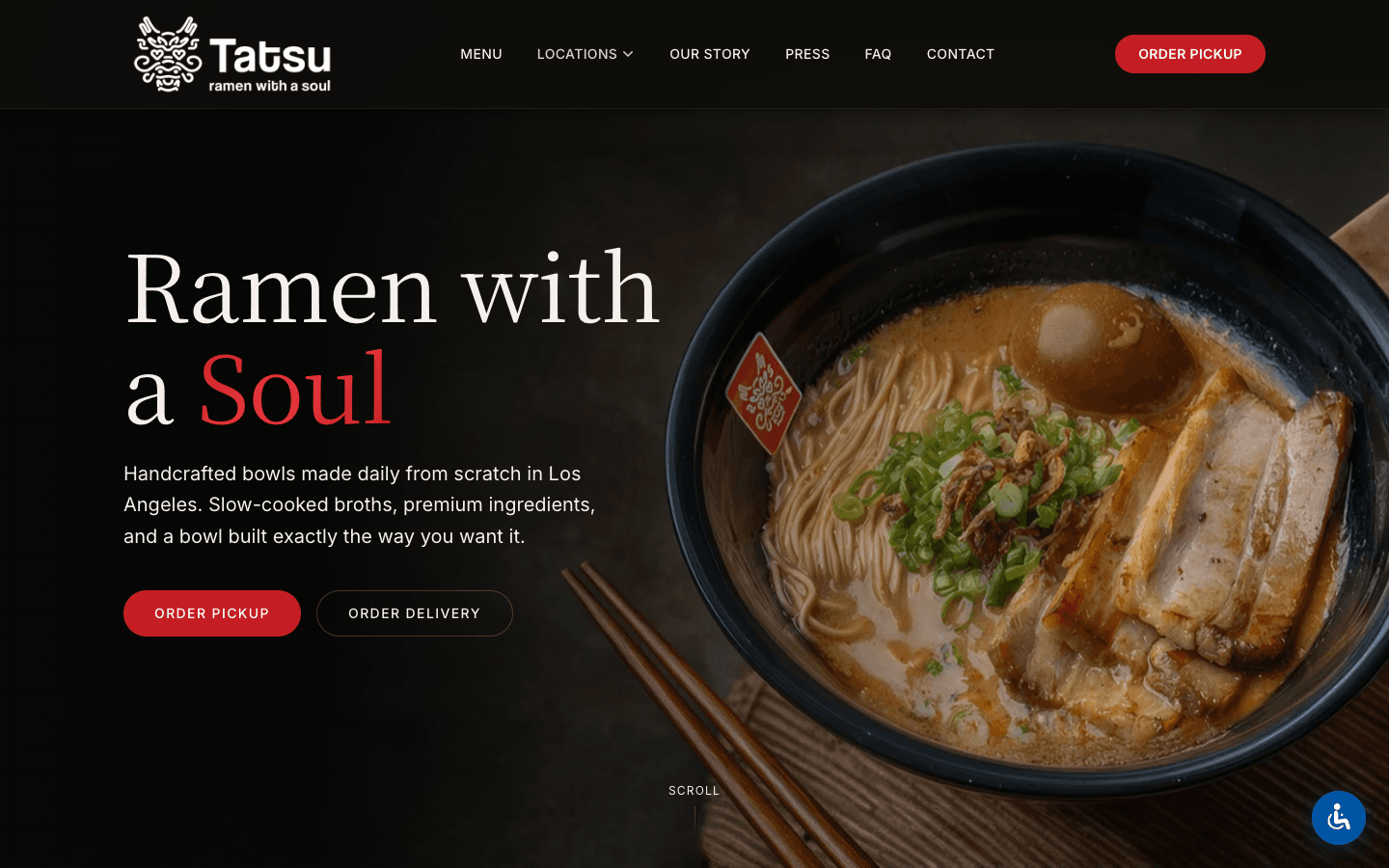
The first screen was shaped around food, atmosphere, and a stronger sense of Tatsu's identity.

Menu Clarity

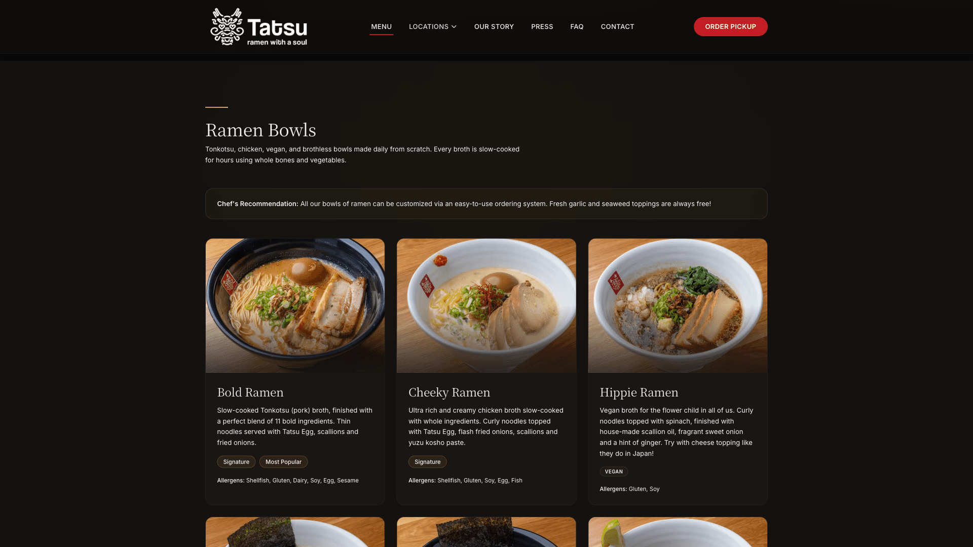
Menu content was organized so guests could browse categories and make decisions without friction.

Location Path

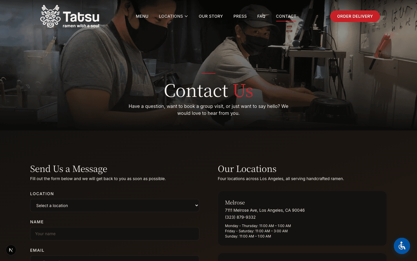
The experience gives multi-location visitors a clearer way to find the right restaurant and next step.

Launch Baseline

Performance, SEO, and automated accessibility checks were treated as launch requirements.

Menu
Tatsu Ramen menu page with food imagery and organized menu categories
Menu pages keep the food doing the persuasion while making categories easier to scan.
Locations
Tatsu Ramen locations page with map and restaurant details
Location content supports guests who need to choose the right restaurant quickly.
Story
Tatsu Ramen story page with brand photography and editorial restaurant content
Brand story sections add texture without turning the site into a long read.

Messaging

Brand atmosphere, translated into practical choices.

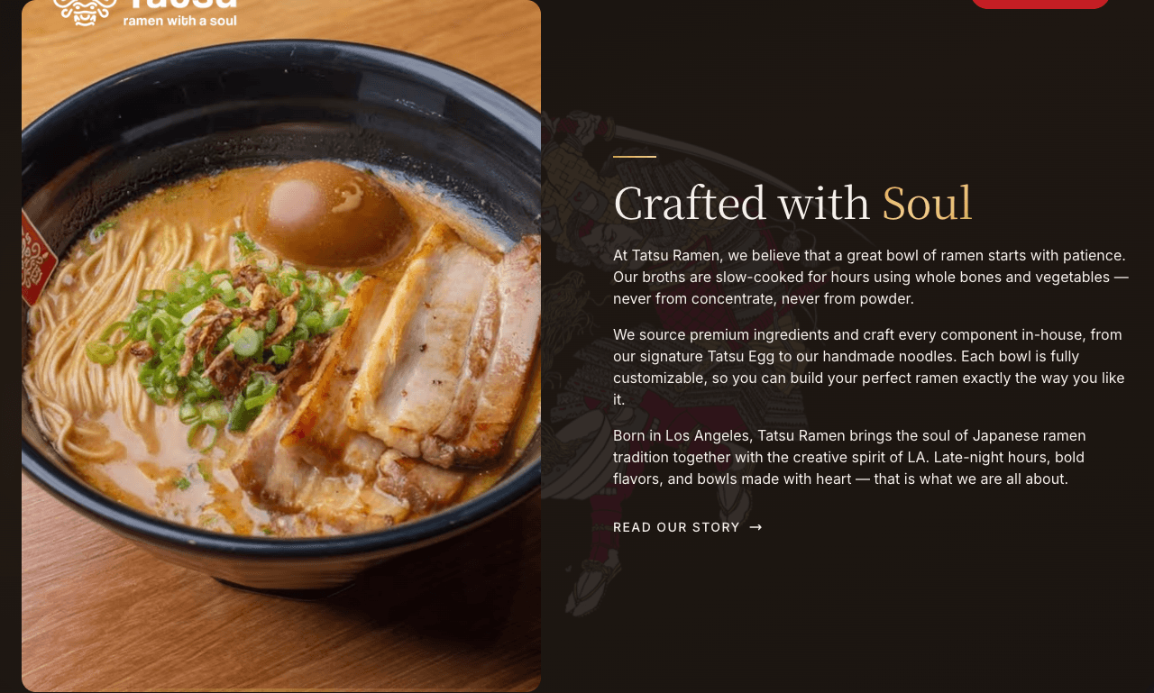
The content keeps the brand confident and food-led while still making the guest's next move clear.

Restaurant sites work best when the brand creates appetite and the structure removes uncertainty.

  • A restaurant brand that feels more vivid from the first screen
  • Food-led pages that make the menu easier to explore
  • Location clarity for guests deciding where to go
  • A faster mobile path for people ready to act
Menu page
Tatsu Ramen menu page showing ramen bowls, menu descriptions, and ordering navigation
The menu page pairs appetite-building food photography with practical details guests need before ordering.
Mobile design
Mobile view of the Tatsu Ramen homepage with restaurant navigation and food imagery
Mobile screens were designed around the way restaurant decisions usually happen: quickly, visually, and close to action.

Design

Atmospheric enough for Tatsu. Clear enough for a hungry guest.

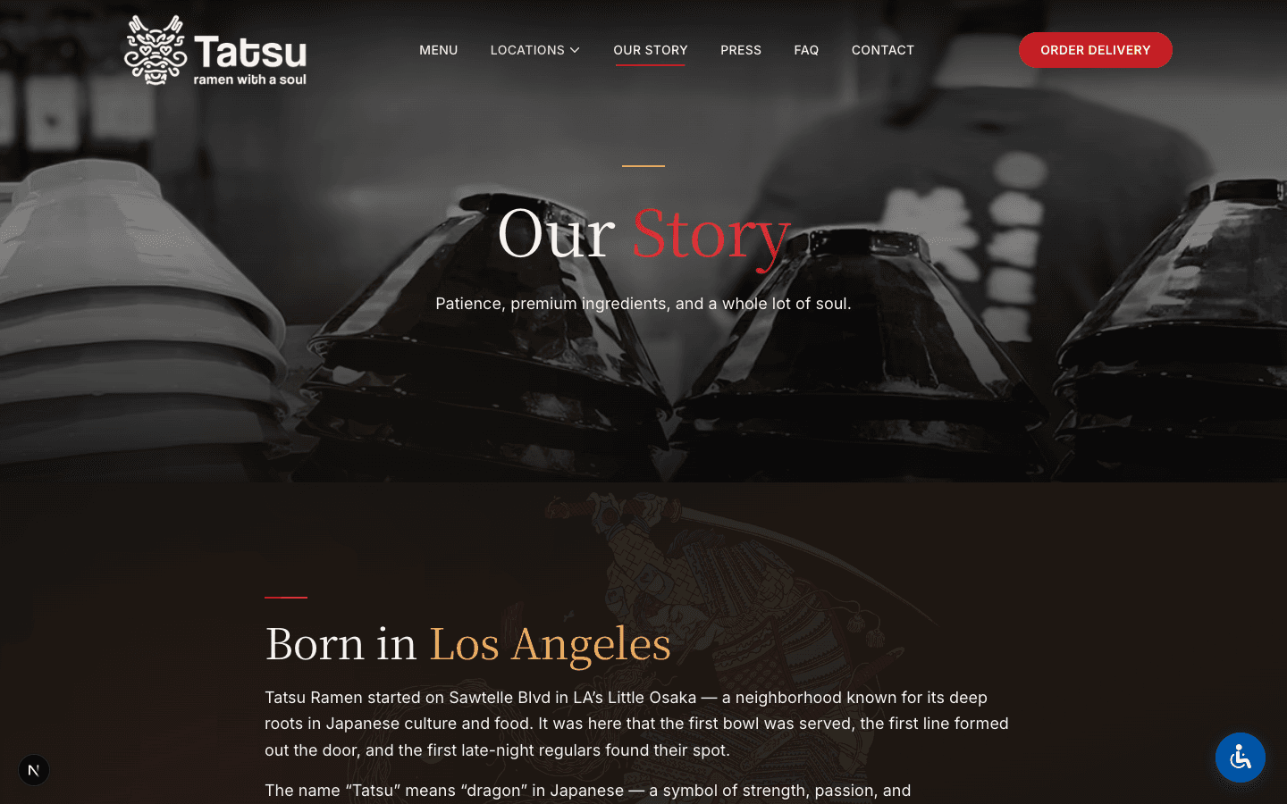
The visual system balances darker brand moments with practical navigation, menu browsing, and location clarity.

Cinematic food photography
Dark, atmospheric brand moments
Clear section hierarchy
Mobile-friendly navigation
Location-first utility
Performance-conscious image treatment

Before

A Brand That Needed More Digital Momentum

  • Restaurant energy needed a stronger digital expression
  • Menu and location paths needed more clarity
  • Mobile visitors needed faster decisions
  • Launch quality needed measurable checks

After

A Website Built Around Appetite and Action

  • Stronger brand-first homepage
  • Clearer menu browsing
  • Easier location discovery
  • Launch-ready performance baseline

Outcome

A clearer path from search result to menu, location, and ordering intent.

The finished site gave Tatsu Ramen a clearer digital front door with a measurable launch baseline for speed, SEO, and automated accessibility review.

7-day design-to-launch sprint
95 mobile PageSpeed at launch
100/100 SEO check at launch
100/100 automated accessibility check

Launch scores should be treated as point-in-time QA checks, not permanent guarantees. Ongoing performance depends on content, media, scripts, hosting, and third-party tools.

If your restaurant experience matters, your website should make people hungry to act.

We help restaurant operators turn strong first impressions into clearer menu, location, ordering, reservation, and inquiry paths.

Next step
Tatsu Ramen contact or location-focused page with restaurant information
A clearer final path gives ready visitors an easier way to act.